Generic and email client-specific rendering defaults
Because email clients render HTML emails in so many different ways, Acorn employs a handful of resets that aim to achieve an acceptable normalization level, to help you create more consistent layouts across the board.
Generic Resets
These apply to all supported email clients.
Tables
- Cell content is set to align vertically to the top, but can be overridden with inline CSS
- Beautiful, golden ratio typography with native font stack is also set as a default for cell content
- Adjacent cells share borders in Outlook, as Acorn defines
border-collapse: collapse;for all tables.
Images
The image reset ensures no borders are added, avoids unwanted gaps below, and overrides the default content line-height. On mobile, in order to prevent blown-up layouts caused by images that are not using the fluid retina technique, they are reset to be 100% wide. Of course, fluid retina overrides this, if used.
Global image reset (desktop + mobile):
img {border: 0; line-height: 100%; vertical-align: middle;}Mobile image reset:
@media  only screen and (max-width: 632px) {
  .wrapper img {max-width: 100%;}

}
Components
- Navigation items are set to
display: inline-block;for consistent alignment and spacing - Spacers and dividers include both generic and client-specific resets, for consistent vertical spacing
Client-specific Resets
These resets target specific email clients, and might be removed or updated in future Acorn releases.
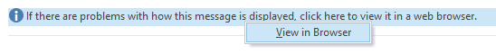
Outlook and Windows Mail
#outlook a {padding: 0;} enables a "View in Browser" bar in Outlook for desktop:
mso-line-height-rule:exactly; forces consistent leading for spacers and dividers
Gmail iOS
u ~ div .wrapper {min-width: 100vw;} forces the viewport to full width