Responsive, 4 column typography grid for emails
Acorn's four-column responsive grid system gives you the flexibility to create layouts of all shapes and sizes, for both desktop and mobile. Create solid desktop emails and adapt them to specific mobile requirements with our utility classes.

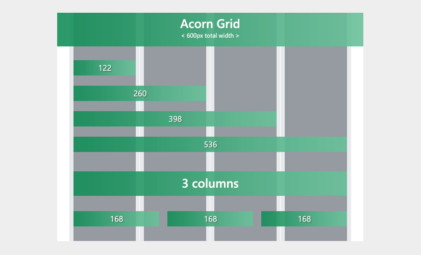
The grey columns in the image above show available content area width.
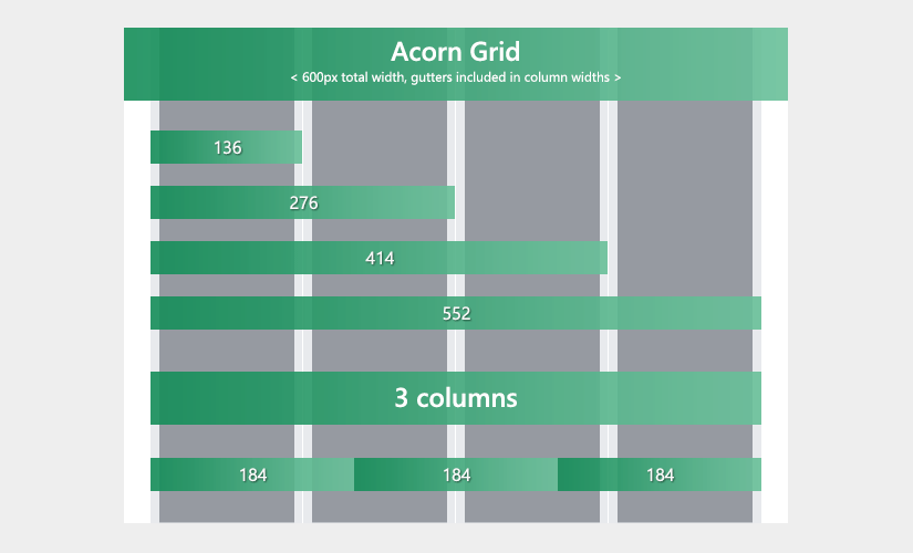
You could remove the column gutters and have more space - here's the same grid depicting column widths with gutters included:

Row
Rows are 100% wide, center-aligned stackable tables that go inside a container and house your column tables. Their maximum width is constrained by the container, so we can take advantage of that and use width="100%" on them. This way, we don't need to worry about resetting widths through CSS when nesting rows:
<table cellpadding="0" cellspacing="0" role="presentation" width="100%">
  <tr>
    <td style="padding: 0 24px;">
      <table cellpadding="0" cellspacing="0" role="presentation" width="100%">
        <tr>
            <td class="col" width="100%" style="padding: 0 8px;">

                Add your content here

            </td>
        </tr>
      </table>
    </td>
  </tr>
</table>
Background Colour
Row tables don't have one, they inherit the Container's background colour in order to avoid a box model bug in some email clients, that creates unwanted hairlines at the bottom. If you do need different background colours on individual rows, make sure to test and check if this hairline is acceptable in your case.
Row tables have 24px padding set on both sides of their table cell. This creates the impression that the container has padding (in fact, it does not), all while giving us opt-in flexibility: the goal here is to give content some breathing room in the container, by creating whitespace.
However, we now have the freedom to choose whether we use this whitespace or not. For example, in case we need an image to stick to the side, we can remove row padding along with the column's padding for that side:
<table cellpadding="0" cellspacing="0" role="presentation" width="100%">
  <tr>
    <td style="padding: 0 24px 0 0;">
      <table cellpadding="0" cellspacing="0" role="presentation" width="100%">
        <tr>
          <td class="col col-sm-3 pt-sm-16" width="292" style="padding: 0 8px 0 0; vertical-align: middle;">
            <img src="https://picsum.photos/292/450?image=1011" alt="My image" width="292">
          </td>
          <td class="col col-sm-3 col-sm-push-1 py-sm-16" width="260" style="padding: 0 8px; vertical-align: middle;">
            <h2 style="font-weight: 400; margin: 0;">Article title</h2>
            <p style="color: #999999; font-size: 12px; font-weight: 400; margin: 0;">NOV 12<sup>th</sup>, 2017</p>
            <p style="color: #666666;">Lorem ipsum dolor sit amet, consectetur adipiscing elit. Aenean sed pharetra neque, at interdum dolor.</p>
            <p class="hide-sm" style="color: #999999; font-size: 13px; font-weight: 400; margin-bottom: 24px;">Nulla quis nunc lacus. Integer fringilla blandit mi, id pharetra nisl. Etiam molestie orci mi, non commodo mauris dapibus sed.</p>
            <table cellpadding="0" cellspacing="0" role="presentation">
              <tr>
                <th bgcolor="#34BF49" style="border-radius: 3px; mso-padding-alt: 6px 42px 12px;">
                  <a href="http://thememountain.com" style="color: #FFFFFF; display: inline-block; font-size: 13px; line-height: 100%; padding: 12px 42px; text-decoration: none;">Read more →</a>
                </th>
              </tr>
            </table>
          </td>
        </tr>
      </table>
    </td>
  </tr>
</table>
Apparent Container Padding
Inside the Row table, Acorn nests another table that contains the grid Columns. As you can see in the example above, this nesting allows us to set container padding and column gutters independently, so that we don't always need to remember to set different paddings on the outer edges of the first and last columns in the grid.
Together, this Row padding combined with Column gutters create an apparent container padding of 32px, resulting in a nice 'boxed' layout on both mobile and desktop.
Of course, you can use any of the mobile spacing helpers on the row table cell, or on each grid column, to fine tune mobile spacing to your requirements.
The grid is designed to work with up to 4 columns in a Row table. If you add more than 4, the Container will expand and Column width will become unpredictable.
Column
Columns are the <td> tags inside the nested table of a Row table:
<td class="col" width="260" style="padding: 0 8px;">1</td>
<td class="col" width="260" style="padding: 0 8px;">2</td>
Each column has a fixed width defined through the width="" attribute, for desktop and tablets. This fixed width is set at 122px in the 4-column grid, but will be different depending on the amount of columns used.
See grid column width reference in the grid image above ↑ and in the examples from the /grid folder ↗
Columns in Acorn have 8px gutters, defined through inline shorthand-CSS padding for each side.
Columns on Mobile
Columns are required to use a col class, needed for normalization on mobile. This class will set the column width to 100%, and will also adjust content line-height to a smaller value, more suitable for mobile devices:
<table cellpadding="0" cellspacing="0" role="presentation" width="100%">
  <tr>
    <td class="spacer py-sm-16" height="32"></td>
  </tr>
  <tr>
    <td style="padding: 0 24px;">
      <table cellpadding="0" cellspacing="0" role="presentation" width="100%">
        <tr>
          <td class="col" width="260" style="padding: 0 8px;">
            <h2 style="font-weight: 500; margin: 0;">First column</h2>
            <p style="color: #999999; font-size: 12px; font-weight: 400; margin: 0;">Full width on mobile</p>
            <p>These columns use the required <code>.col</code> class.</p>
          </td>
          <td class="col" width="260" style="padding: 0 8px;">
            <h2 style="font-weight: 500; margin: 0;">Second column</h2>
            <p style="color: #999999; font-size: 12px; font-weight: 400; margin: 0;">Also full width on mobile</p>
            <p>On mobile, this makes them 100% wide, so they stack.</p>
          </td>
        </tr>
      </table>
    </td>
  </tr>
  <tr>
    <td class="spacer py-sm-16" height="32"></td>
  </tr>
</table>
Because we're using <td> and resetting it to display: inline-block; for mobile, column stacking cannot work properly in the Android 4.4 native email client. There are no plans to support this client in Acorn.
Column Widths On Mobile
If you don't want columns to stack on mobile, you can use custom column mobile width classes:
The class names follow the familiar Bootstrap 4 naming convention:
col- as in 'column'-sm- indicates it will apply on small screens only-X- number from 1 to 3, or 'third': the equivalent amount of desktop columns to span
.col {
  box-sizing: border-box;
  display: inline-block!important;
  line-height: 23px;
  width: 100%!important;
}

.col-sm-1 {max-width: 25%;}
.col-sm-2 {max-width: 50%;}
.col-sm-3 {max-width: 75%;}
.col-sm-third {max-width: 33.33333%;}
These classes use percentage-based max-width, instead of width. This way, we only constrain the mobile width, instead of overriding it with !important. Being able to write less code is always a win :)
You can use any combination of the mobile width classes. If their sum exceeds the equivalent of 4 columns, the first column that won't be able to fit in the same row will break onto the next one:
<table cellpadding="0" cellspacing="0" role="presentation" width="100%">
  <tr>
    <td style="padding: 0 24px;">
      <table cellpadding="0" cellspacing="0" role="presentation" width="100%">
        <tr>
          <td class="col col-sm-2" width="168" style="padding: 0 8px;">
            <p>2 cols on mobile</p>
          </td>
          <td class="col col-sm-2" width="168" style="padding: 0 8px;">
            <p>2 cols on mobile</p>
          </td>
          <td class="col" width="168" style="padding: 0 8px;">
              <p>Full width on mobile. This column breaks on the next line, because it only uses class="col"</p>
          </td>
        </tr>
      </table>
    </td>
  </tr>
</table>
Remember
Columns that only have the col class will be 100% wide and break on to their own line on mobile.
Column Offsets On Mobile
You can use offset classes to push columns to the right on mobile. These use the CSS margin-left property.
Just like mobile widths, the naming convention follows the Bootstrap 4 pattern:
col- as in 'column'-sm- indicates it will apply on small screens only-push- indicates it will push the column-X- number from 1 to 3, or 'third': the equivalent amount of desktop columns to span
.col-sm-push-1 {margin-left: 25%;}
.col-sm-push-2 {margin-left: 50%;}
.col-sm-push-3 {margin-left: 75%;}
.col-sm-push-third {margin-left: 33.33333%;}
You can use these classes to fine tune and adapt your layouts for mobile devices. For example, let's create a 3-column desktop layout that changes to 2+1 columns on mobile, and aligns the third column (price) with the second one (description) on mobile:
<table cellpadding="0" cellspacing="0" role="presentation" width="100%">
  <tr>
    <td class="spacer py-sm-16" height="32"></td>
  </tr>
  <tr>
    <td style="padding: 0 24px;">
      <table cellpadding="0" cellspacing="0" role="presentation" width="100%">
        <tr>
          <td class="col col-sm-2" width="128" style="padding: 0 8px;">
            <img src="https://picsum.photos/256?image=1059" alt="Product Title" width="128">
          </td>
          <td class="col col-sm-2" width="328" style="padding: 0 8px; vertical-align: middle;">
            <h4 style="margin: 0;">Product title</h4>
            <p style="color: #999999; margin: 0;">Short product description text here</p>
          </td>
          <td class="col col-sm-2 col-sm-push-2" width="48" style="padding: 0 8px; vertical-align: middle;">
            <h4 style="margin: 0;">Price</h4>
            <p style="color: #999999; margin: 0;">$49</p>
          </td>
        </tr>
      </table>
    </td>
  </tr>
  <tr>
    <td class="spacer py-sm-16" height="32"></td>
  </tr>
</table>
Responsive breakpoints
Acorn is desktop-first.
The fixed-width container and columns are overridden for mobile devices through the use CSS media queries.
Large breakpoint
For large-ish screen sizes (i.e. landscape view), Acorn resets Wrapper and Container widths to 100%, but the desktop column widths are still being used. This affects all devices with a screen size between 481px and 632px:
@media  only screen and (max-width: 632px) {
  .wrapper img {max-width: 100%;}
  u ~ div .wrapper {min-width: 100vw;}
  .container {width: 100%!important; -webkit-text-size-adjust: 100%;}
}
Small breakpoint
This is where the fun starts. This media query applies to most devices, up to 480px screen width:
@media  only screen and (max-width: 480px) {
    ...
}