
Make your emails interactive
Kant Email includes interactive sections that will help you create unique, immersive emails.
Accordion
Accordions can be useful to reduce the height of your email on mobile. In supporting email clients, the content area is collapsed and can be expanded by clicking on the title.
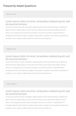
On mobile, it works just like you're used to: clicking an accordion title reveals the content inside it. The interaction is handled with :hover, just like with the hamburger menu. Therefore, it doesn't close when you click the title again - it doesn't work like a toggle:
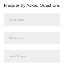
In most mobile email clients (except iOS Mail) you can touch outside to close it, or touch another title to close the current one and open that instead. For desktop email clients, the accordion items are always expanded.
MailChimp Note
The accordion is not currently supported by MailChimp, because their system strips out any form tags, and our accordion needs to use <button> tags. Therefore, our MailChimp-integrated templates do not include the Accordion section.
Customisation
Text can be styled with inline CSS.
Title Background
Background of the title can be changed in the background-color inline CSS of the <button class="toggle-trigger"> button, and on the <table> right inside it.
Top & Bottom Spacing
Accordions use both Universal and Row spacers from Pine, so you need to look for and adjust the values in both lines like this:
<div class="spacer" style="font-size: 30px; line-height: 30px; mso-line-height-rule: exactly;"> </div>... and like this:
<tr>
<td class="spacer" height="40" style="font-size: 40px; line-height: 40px; mso-line-height-rule: exactly;"> </td>
</tr>On mobile, these spacers are reset to be 30px high. You can change that in the embedded CSS:
.spacer {height: 30px; line-height: 100% !important; font-size: 100% !important;}