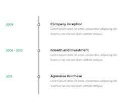
Display a series of events over a period of time
Timeline is a 3-column layout that shows dates, a visual separator that connects the rows, and the actual content on the right. Useful for displaying a series of events, such as a conference schedule. Or maybe even a shipping status update in a notification email?
On mobile, the connecting "pipe" image is hidden, and the columns stack.

Customisation
Text
Font size, colour, weight, spacing, all can be changed through inline CSS.
Image
Simply change the src="" and width="" of each image. If you want use retina images, make sure your own image is twice the pixel size of the original.
Top & Bottom Spacing
On desktop, Timeline doesn't use vertical spacing - it's meant to "stick" to other sections. There's also no spacing between rows, since the "pipe" images need to be connected.
On mobile though, it uses Pines's mobile spacing helpers to create consistent vertical spacing between timeline events. For mobile spacer customisation, learn more about spacers in Pine.
