
Large & bold. Bulletproof background images.
A HERO section is a great way to draw attention to key information, an image or a product, by using bold imagery that works in almost any email client. Sartre Email comes with several variations:
- With Background Image
- Split Content
- With Video
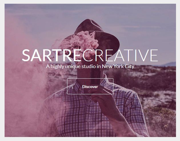
With Background Image
This HERO section has a full width background image, overlayed with centered, editable content.
It has background image support for most email clients (including Outlook and Windows Mail), and includes a background colour fallback for cases when the image might not be loaded. See more in Customisation.
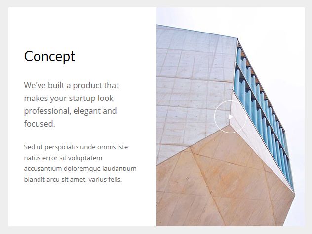
With Split Content
The Split HERO separates text and images into two columns that switch to a stacked layout on mobile.
It comes in several types:
- Content Left/Right
- With Inline Image
- With Background Image
- Content Top Left/Right
- Content Left/Right Overlayed
It also has Outlook & Windows Mail background image support, but just for the main image: these email clients only support a colour fallback for the semi-transparent overlay, which you can control with the bgcolor="" attribute.
With Video
The HERO With Video allows you to use HTML5 video in your email campaigns, all while providing a very solid fallback for clients that do not support video in email.
In our tests, the following clients have played the video:
- iPhone (iOS Mail)
- iPad (iOS Mail)
- Apple Mail
- Outlook on Mac
- Thunderbird
- Android Default Email Client (in most cases)
In supporting email clients, the video will show a play button.
When you play the video, most of these clients will automatically start playing the video in fullscreen. Although there is a playsinline attribute that you can add to the <video> tag, iPhone for example ignores it and still goes fullscreen.
Note
Currently, no online email builder provides a visual way of editing HTML5 video sections. You will need to edit HTML in order to customise it, so please read on.
How it works
The HERO With Video contains a <video> tag, inside which we add a <source> tag for defining the source of the video. The <video> tag also has a poster="" attribute that defines what image is shown before playing the video.
Then, whatever HTML we use after the <source> tag, will be our fallback content that will show up in email clients that do not support HTML5 video. In Sartre Email, we use a regular HERO With Background Image as the fallback, so you still get to see rich, editable content that users can interact with (for example, editable text and a "Play" button that can be linked to a YouTube video).
Since all our HERO sections have support for background images in Outlook and Windows Mail, you can use this fallback to show the same poster image, or a different image in email clients that can't play the video. In fact, you could even take it a step further, and use an animated GIF as the fallback background image (maybe a few frames from the beginning of your video?).
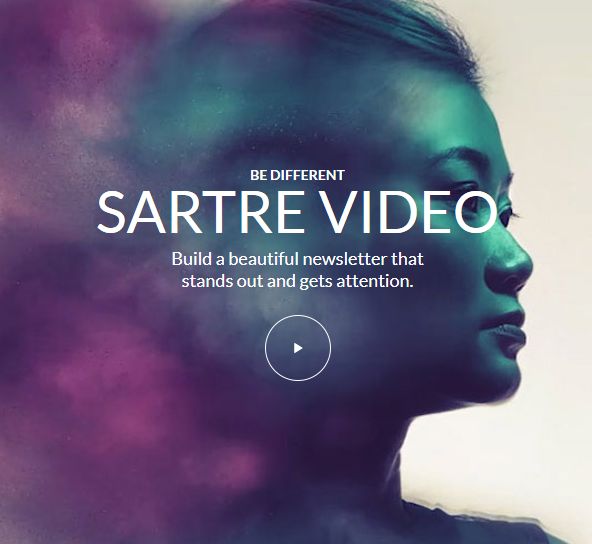
Above: fallback content for HERO With Video, that will be shown in clients such as Outlook or Gmail.
Video HERO Editing
Since no email builder can do it for you, you will need to edit the HTML yourself.
MailChimp and Video Emails
MailChimp currently does not support HTML5 video, it completely strips out the necessary tags when you import the template. Because of this, our MailChimp integration does not include the HERO With Video that uses HTML5 video (note: StampReady → MailChimp will not work either). Instead, the Video Agency template provides a regular HERO. If you want to send an email with HTML5 video, don't use MailChimp, as it is not currently possible.
For Campaign Monitor, you will need to edit the all-in-one HTML file before uploading it, as their editor provides no way of editing the template's HTML code.
If you're going to edit HTML files directly, here's a simple step-by-step guide:
1. Poster image - check your video's dimensions
Most videos nowadays are widescreen: 1280x720, 1920x1080, etc. - but what we need to know is the video's height when resized.
If your video were to be proportionally resized to be 600px wide, what would its height be?
Short answer: use this calculator, add your video's dimensions, type 600 in the New Width field and don't fill in the New Height field. What you get in the New Height field is what we're after (we recommend usually rounding it up).
Formula:
posterImageHeight = (videoHeight / videoWidth) x 600
The idea is to get the ratio of your video, and then multiply it by 600, which is the width of our template. With videos in common widescreen resolutions like those mentioned above, you'll usually get 337.5. Our own HERO With Video example rounds that up to 338px - we use 600x338px images for both the poster and the fallback background image.
2. Video Source
The <source> tag has a src="" attribute that defines where the video should load from. This must be a URL pointing to the video file that you have hosted somewhere. For example:
<source src="https://s3.envato.com/h264-video-previews/8c15056c-f771-47e6-a6b6-45e90bccdd26/1749392.mp4" type="video/mp4">You can use multiple <source> tags one right after the other, to specify different types of media.
MP4 videos will work in most of the supporting email clients, but if you want, you can add a second <source> tag with the video in OGG format, to support Mozilla Thunderbird and Firefox:
<source src="http://techslides.com/demos/sample-videos/small.ogv" type="video/ogg">Note that while the video type/format is OGG, the file extension is .ogv
Other video settings
As you may know, there are many other attributes that you can use on the <video> tag. Our own products include the controls attribute, which shows player controls (don't remove this, as users will have no means of playing the video).
While you're free to experiment with them, we would generally advise against using the autoplay - most supporting email clients ignore it anyway, because it's bad user experience.
Once you're done setting up the video, you can customise the fallback just as you would customise a regular HERO With Background Image.
Customisation
Inline Images
Simply change the src="" and width="" of each image. If you want use retina images, make sure your own image is twice the pixel size of the placeholder.
Background Colour
Change the HEX colour inside bgcolor="" on the <td>'s:
<td class="px-sm-16" align="center" bgcolor="#EEEEEE">
    <table class="container" cellpadding="0" cellspacing="0" role="presentation" width="600">
        <tr>
            <td style="background-image: url('https://dummyimage.com/1200x1000/0CBACF/000000'); background-color: #0CBACF; background-repeat: no-repeat; background-position: center; background-size: cover;">
                ...
            </td>
        </tr>
    </table>
</td>
Throughout the template, we use #EEEEEE for the 'outside' colour (basically, the email body). HEROs use #0CBACF or #232323 for the background image fallback colour, and it's defined through inline CSS rather than through a bgcolor="" attribute.
When using the integrated versions, such as MailChimp or StampReady, you need not worry about this: controls for changing them are provided through their UI.
Background Image
Change the image path in the inline background-image CSS property, and in the src="" of the <v:image /> tag, for Outlook & Windows 10 Mail.
<td style="background-image: url('https://dummyimage.com/1200x1000/0cbacf/000000'); ...">
    <!--[if gte mso 9]>
    <v:image src="https://dummyimage.com/1200x1000/0CBACF/000000" ... />
    [...]
</td>
Top & Bottom Spacing
Change the line-height: value on the <div class="spacer":
<div class="spacer line-height-sm-0 py-sm-24" style="line-height: 150px;">‌</div>The top and bottom spacers for HEROs are very important, as they control the height of the section. If this height is bigger than your background image's height, the image will try to cover it, resulting in a lower quality and parts of it not showing. This doesn't affect Outlook though, as this client will use the value in the height styles set on the VML tags.
For spacing on mobile, we generally use the py-sm-24 class, that sets the spacer to be 48px high, so that your HERO image isn't cut off too much due to the layout adapting to the screen size.
24 is the largest padding utility in Acorn, but you can change it to one of the other, smaller mobile spacing classes in Acorn. And, if 48px isn't enough, you can create your own mobile spacing utilities - learn more about spacing utilities and spacer components in Acorn.
Limitations & Other Notes
HERO Split Semi-transparent Overlay
Split HEROs with Overlayed content have an overlay-sm-bg class on the column with the background image. This allows for adding a semi-transparent background colour on it, for mobile.
If you want this colour to be something else than the default, you have to edit it manually in the CSS from the <head>. The first colour is the fallback for when transparency might not be supported, and the second overrides it for clients that do support it:
.overlay-sm-bg {background: #232323; background: rgba(0,0,0,0.4);}Outlook Background Images
When using background images in Outlook, there are a few caveats that you need to be aware of.
Image Sizes
For sections that support background images, it is recommended that you use a background image that has the dimensions of the dummy image the template provides, or double (for retina).
For retina images, make sure that they are exactly double the size in comparison to those that the template provides. For example, if a HERO uses a 600x500 image, you should use a 1200x1000 one for retina, since it's exactly two times larger.
Important
If you don't stick to the recommended aspect ratio, Outlook will crop or stretch your background image and may leave you with important parts of your visual message not showing up, or show a distorted image. If precision is important, we recommend sticking to the sizes of the placeholder images.
Content Height
If you add content that increases the height of a section, note that Outlook will not increase the sections' height for you automatically. You will need to do this manually, by changing the CSS height on both the <v:image /> and the <v:rect> VML tags. Outlook treats this height as fixed, so no matter the amount of content inside, this will be your HERO's height:
<td style="background-image: url('https://dummyimage.com/1200x1000/0CBACF/000000'); background-color: #0CBACF; background-repeat: no-repeat; background-position: center; background-size: cover;">
    <!--[if gte mso 9]>
    <v:image src="https://dummyimage.com/1200x1000/0CBACF/000000" xmlns:v="urn:schemas-microsoft-com:vml" style="width:600px;height:500px;" />
    <v:rect fill="false" stroke="false" style="position:absolute;width:600px;height:500px;">
    <div><![endif]-->
Heads Up!
- Don't change the
<v:image />or<v:rect>width style - it will break the template in Outlook. - Don't remove the
<v:image />or<v:rect>height - it will collapse and squash the section. - Don't remove other styles/attributes/tags - the section will very likely stop rendering properly.
- Except for Mailster and StampReady, the online builders for which we provide an integrated version do not update the VML code for Outlook background images when using their visual editors. In such cases, you will need to manually adjust the HTML code and add the URL to your image inside the
<v:image src="..." />. Alternatively, simply use StampReady to build your layout, export it, and then import it to your provider.