
Grid layouts to showcase your work
Image Grid sections are grid layouts that focus on imagery to create a strong visual impact. Use them to showcase your work, products, portfolio, offers, etc. - they're well suited for any type of email that requires images to reinforce your message.
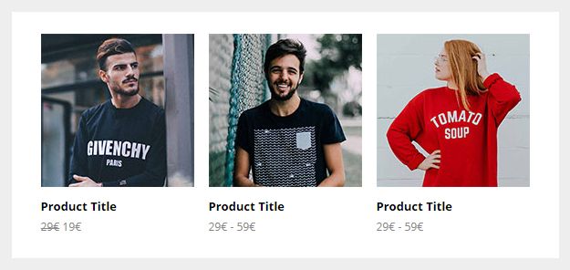
Columns With Captions
Great for displaying products or offers in an organized fashion. Choose from 2, 3, and 4-column variations.
Full Width Image
A simple, full width image. This is an inline image, not a background image. So unlike those, it will always be visible because it's supported everywhere. It'll also show in full, since it doesn't rely on its container height.

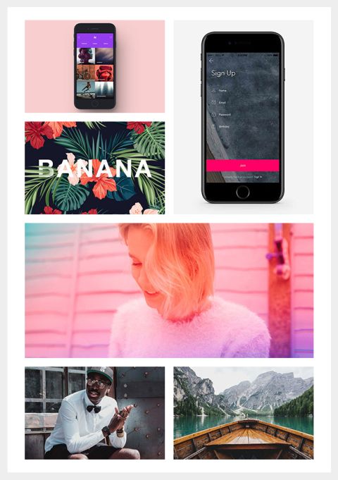
Masonry Grid
An image grid with different sizes and layout variations, great for showing off a portfolio, shop products, albums - you name it. On mobile, the columns go full width and stack.
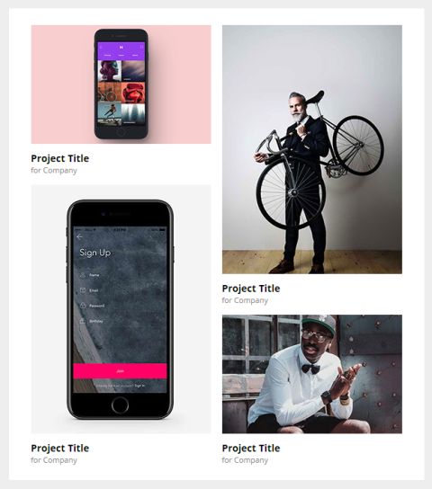
Masonry Grid With Captions
The Masonry Grid, but with captions for each image.
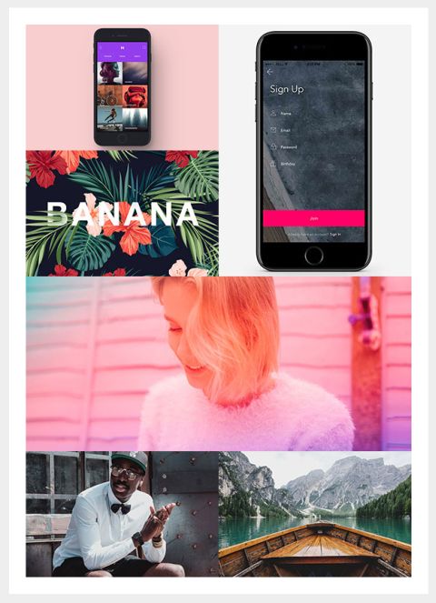
Masonry Grid No Gutters
This variation removes the gutters between grid columns, so that your images stick to one another. The container gutters are preserved, to 'box' it in and align it with your text.
Masonry Grid No Gutters - Full Width
Same as above, but with container gutters also removed, so that you can stick images together in creative ways.

Logo Grid
The Logo Grid is a four-column grid layout, ideal for showing off partner or sponsor logos. On mobile, the logo columns go full width and stack.
Customisation
Images
Simply change the src="" and width="" of each image. If you want use retina images, make sure your own image is twice the pixel size of the placeholder.
Captions
Image Grids With Captions have linked text below the image, which you can customise by changing the default inline styles. Remember to update the links.
Top & Bottom Spacing
Change the line-height: value on the <div class="spacer":
<div class="spacer line-height-sm-0 py-sm-8" style="line-height: 24px;">‌</div>For spacing on mobile, we generally use the py-sm-8 class, that sets the spacer to be 16px high. You can change it to one of the other mobile spacing classes in Acorn. Learn more about spacers in Acorn.