
Connect with your audience
Social sections are great way to connect with your email audience. You can use the social icons provided in the template, or replace them with your own.
Sartre Email currently ships with two types of social sections:
- Social 1
- Social 2
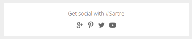
Social 1
Simple and clean, with centered icons and a title above.
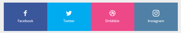
Social 2
Four-column layout with edge-to-edge background. Includes icon and text, as well as a background colour to match the social network branding. Don't know the HEX code for a specific brand colour? Checkout BrandColors.
On mobile, the columns go full-width and stack.
Customisation
Icons
Use icons that contrast with the sections's background colour. Retina icons supported.
Sartre Email comes with a variety of social icons which you can use in the Preheader section. If using different icons, make sure that their size is the same as the ones we provide.
Text
Change the HEX colour from the inline CSS.
Background colour
Change the HEX colour inside bgcolor="" on the <td>'s:
<td class="px-sm-16" align="center" bgcolor="#EEEEEE">
    <table class="container" cellpadding="0" cellspacing="0" role="presentation" width="600">
        <tr>
            <td class="px-sm-8" align="left" bgcolor="#FFFFFF" style="padding: 0 24px;">
                ...
            </td>
        </tr>
    </table>
</td>
For Social 2, change the bgcolor="" on each <td class="col":
<td class="col" align="center" bgcolor="#3A579B" width="150" style="padding: 24px 0;">
  ...
</td>
Spacing
Social 1: change the line-height: value on the <div class="spacer":
<div class="spacer line-height-sm-0 py-sm-8" style="line-height: 24px;">‌</div>Social 2 doesn't have top/bottom spacing. Instead, each column has its own vertical padding.
For mobile spacer customisation, learn more about spacers in Acorn.