
The place for brand logos and menus
Sartre Email includes multiple Header sections:
- Centered
- With Logo
- With Menu
- With Split Menu
- Left/Right Aligned
- With Basic Menu
- With Hamburger Menu (interactive)
- Left/Right Aligned With Title
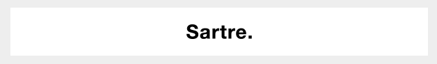
Centered
With Logo
The Centered Logo Header simply shows a center-aligned logo. You can use a background colour to give it a boxed or full width aspect.
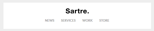
With Basic or Hamburger Menu
A centered logo followed by a centered navigation component.
In supported mobile email clients, the variation with the hamburger menu hides the menu items and shows a menu icon instead. Here's an animated example:

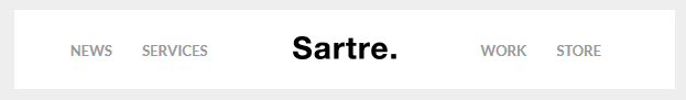
With Split Menu
This type of Header uses menu links on both sides of a centered logo.
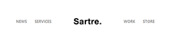
On mobile, it uses the Reverse Stack technique in Acorn so that menu items show below the logo:
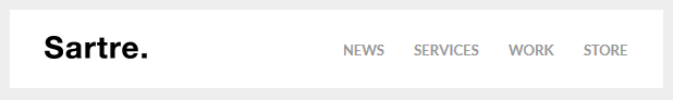
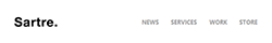
Left/Right
The Left or Right Aligned Headers show the logo on the left or right, and a navigation component or simple headings on the opposite side. Like the Centered one, it comes with both a Basic and a Hamburger menu.
On mobile, the logo image and menu will stack and align to center, just like the menu icon does in this animation:
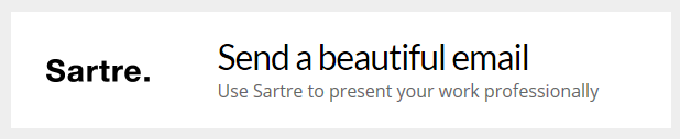
With Title
This variation uses a large title and a subtitle instead of a menu. The text uses responsive font sizes, so that it limits the risk of your emails blowing up on mobile.
Customisation
Menu Items
Menu items are simple links that can be styled with inline CSS. Learn more about the email navigation component in Acorn.
Logo & Images
Simply change the src="" and width="" of the logo. If you use a retina logo image, make sure your width="" is half of what the original image size is in pixels.
Note
The Hamburger menu icon currently cannot be made editable in any of the template integrations we provide. If you want to customize the icon, make sure you do that manually in the code.
Background Colour
Change the HEX colour inside bgcolor="" on the <td>'s:
<td class="px-sm-16" align="center" bgcolor="#EEEEEE">
    <table class="container" cellpadding="0" cellspacing="0" role="presentation" width="600">
        <tr>
            <td class="px-sm-8" align="left" bgcolor="#FFFFFF" style="padding: 0 24px;">
                ...
            </td>
        </tr>
    </table>
</td>
Throughout the template, we use #EEEEEE for the 'outside' colour (basically, the email body), and #FFFFFF or #232323 for the inside of a section. When using the integrated versions, such as MailChimp or StampReady, you need not worry about this: controls for changing them are provided through their UI.
Top & Bottom Spacing
Change the line-height: value on the <div class="spacer":
<div class="spacer line-height-sm-0 py-sm-8" style="line-height: 24px;">‌</div>For spacing on mobile, we generally use the py-sm-8 class, that sets the spacer to be 16px high. You can change it to one of the other mobile spacing classes in Acorn. Learn more about spacers in Acorn.
Limitations & Other Notes
Hamburger menu client support
The interactive hamburger menu has limited support on mobile, because it needs CSS :hover and this isn't supported everywhere. The good news is that Apple Mail and Outlook support it, and the former is one of the most used mobile email clients.
As far as Gmail on mobile goes, Google have removed support for :hover. Our template targets Gmail apps directly and makes the hamburger menu fall back to a basic menu instead, so your subscribers can actually use the menu.
Email builders and menu items
Because navigation menus for email can be coded in so many different ways, currently no email builder provides an easy way to add extra menu items (or sometimes even remove them). Such customisations will need to be done in code.