Showcase a feature of your product or work
A feature section is an elegant way to showcase a particular feature or product.
Sartre Email comes with several feature sections:
- Feature Product
- Feature Columns
- Feature Stats
- Content Left/Right (+Boxed)
- Feature Text With Button
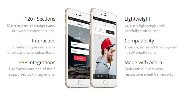
Feature Product
3-column section with an image in the middle and text rows on the sides. Great for showcasing app features.
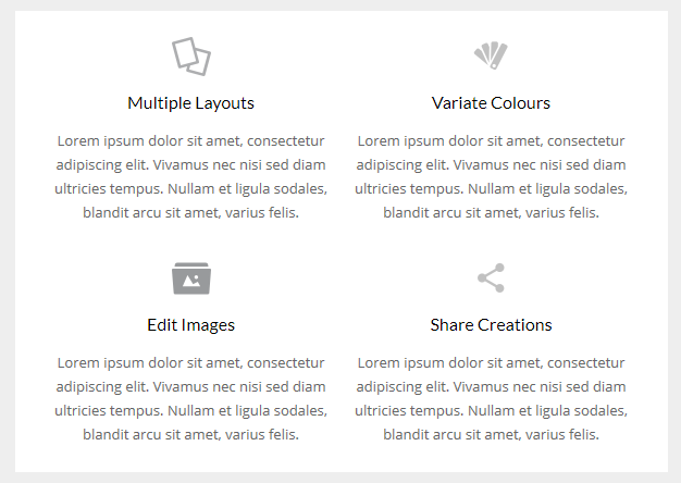
Feature Columns
Two rows with two columns each. Columns have a centered image at the top, followed by text. On mobile, the columns go full width and stack.
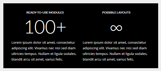
Feature Stats
Two half columns, with centered text and big headlines. Great for displaying a set of features.
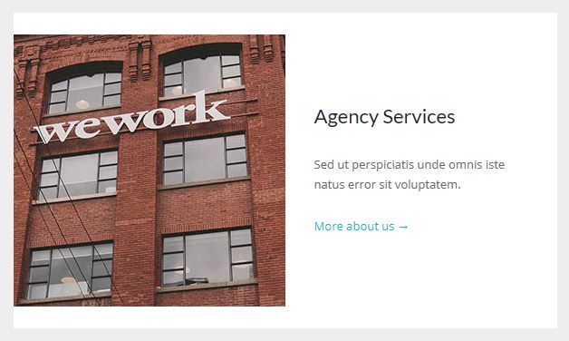
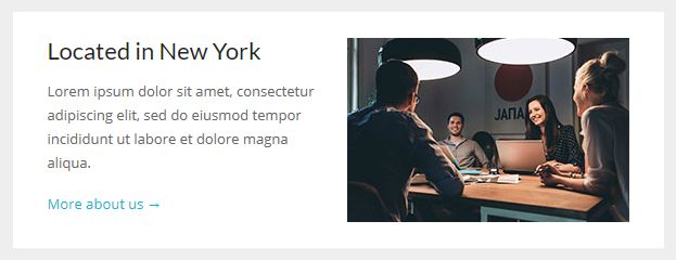
Content Left/Right
Two columns, one with a header, text and a link, the other with an image that sticks to the edge of the email container. They stack on mobile, and the one with the image on the right uses the awesome reverse stack techinque from our framework, for consistent hierarchy.
Content Left/Right Boxed
Similar to the above, but with container gutters so that the image doesn't stick to the edge.
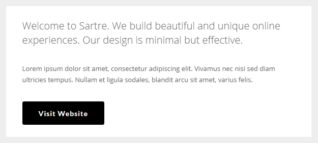
Feature Text With Button
One column, full width text, followed by a call to action button. Works well with HEROs.
Customisation
Buttons & Links
Links and buttons can be customised with inline CSS. Checkout the button component in our email framework.
Images
Simply change the src="" and width="". For retina images, you can keep the width="" defined by the template, and use an image that is double the width and height of the placeholder image, so that it looks sharp on mobile.
Top & Bottom Spacing
Change the line-height: value on the <div class="spacer":
<div class="spacer line-height-sm-0 py-sm-8" style="line-height: 24px;">‌</div>For spacing on mobile, we generally use the py-sm-8 class, that sets the spacer to be 16px high. You can change it to one of the other mobile spacing classes in Acorn. Learn more about spacers in Acorn.
