
For all your blogging needs
Blog sections are grid layouts that focus on imagery and content. They are perfect for content-focused newsletters.
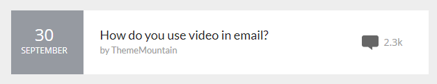
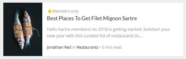
Blog List
Compact design intended for newsletters that need to show many blog posts.
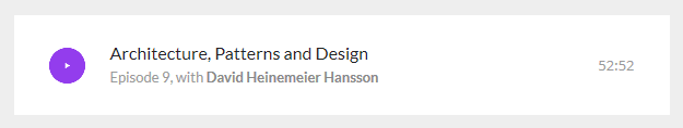
Blog Podcast
Similar to the Blog List, but with a play button icon and episode length instead of comments.
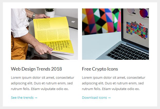
Blog Columns Boxed
The mandatory column(s) blog post design. Included are sections with up to 4 columns.
This is the default variant, where columns are visually grouped together and share the same background colour.
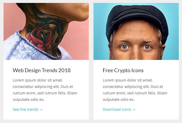
Blog Columns Cards
The Cards are 'isolated' blog post columns that use the email body background colour in order to achieve a Polaroid-like or ...cards layout 🙂
Blog Image Left/Right
Compact, with an image on the side, it's ideal if you need to show many posts but also have a short excerpt.
Customisation
Links
Change the HEX colour from the link's inline CSS.
Icons
Retina icons supported, just specify half the natural image width, as shown in Acorn.
Note: by default, some icons use emoji for alt text, like the 💭 or the 🔒. Some email clients don't support emojis, so remember to consider your audience when using them.
Background Colour
Change the HEX colour inside bgcolor="" on the <td>'s:
<td class="px-sm-16" align="center" bgcolor="#EEEEEE">
    <table class="container" cellpadding="0" cellspacing="0" role="presentation" width="600">
        <tr>
            <td class="px-sm-8" align="left" bgcolor="#FFFFFF" style="padding: 0 24px;">
                ...
            </td>
        </tr>
    </table>
</td>
Throughout the template, we use #EEEEEE for the 'outside' colour (basically, the email body), and #FFFFFF or #232323 for the inside of a section. When using the integrated versions, such as MailChimp or StampReady, you need not worry about this: controls for changing them are provided through their UI.
Top & Bottom Spacing
Change the line-height: value on the <div class="spacer":
<div class="spacer line-height-sm-0 py-sm-8" style="line-height: 24px;">‌</div>For spacing on mobile, we generally use the py-sm-8 class, that sets the spacer to be 16px high. You can change it to one of the other mobile spacing classes in Acorn. Learn more about spacers in Acorn.