
For all your blogging needs
Blog sections are grid layouts that focus on imagery and content. They are perfect for content-focused newsletters.
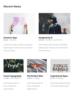
Blog Grid
A complex grid layout with 2 featured articles at the top, and 3 smaller ones below, perfect for a blog newsletter. Includes images, article titles, date fields, and excerpts. On mobile, the columns go full width and stack.
Customisation
Links
Change the HEX colour from the link's inline CSS.
Background Colour
Change the HEX colour code inside bgcolor="" on the row table wrapper:
<table class="row" align="center" bgcolor="#FFFFFF" cellpadding="0" cellspacing="0">
    ...
</table>
Top & Bottom Spacing
Change the height, font-size, and line-height: values on the <td class="spacer">:
<tr>
<td class="spacer" height="80" style="font-size: 80px; line-height: 80px; mso-line-height-rule: exactly;"> </td>
</tr>On mobile, these spacers are reset to be 30px high. You can change that in the embedded CSS:
.spacer {height: 30px; line-height: 100% !important; font-size: 100% !important;}