
Grid layouts to showcase your work
Portfolio sections are grid layouts that focus on imagery and alignment. Kant comes with several portfolio sections:
- Products with Captions
- Project Masonry with Captions
- Project Masonry
- Project with Captions
- Logo Grid
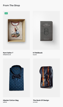
Products with Captions
A simple two column grid that includes images, headings, and prices. This is a variation best suited for ecommerce. On mobile, the columns go full width and stack. But you can easily change that by adding a mobile column helper class next to the column class in <th class="column ..."> (see mobile column modifiers).
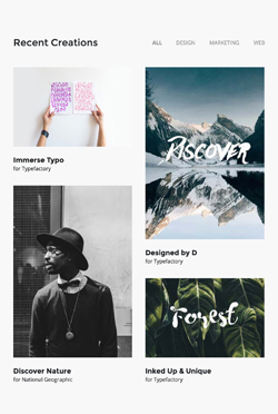
Project Masonry with Captions
An image grid with different sizes, great for showing off a portfolio, or even shop products. On mobile, the columns go full width and stack.
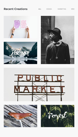
Project Masonry
Similar in concept to the previous section, but a little less complex. It includes a header that goes inline with a hamburger menu, which you can use as a 'project filter' by linking menu items to different pages on your site. On mobile, the columns go full width and stack.
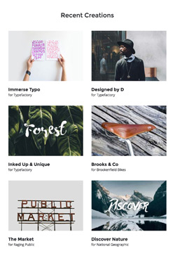
Project With Captions
A simple two column, multiple row grid, that includes images and headings. On mobile, the columns go full width and stack.
Logo Grid
The Logo Grid is a multi-column grid layout, ideal for showing off partner or sponsor logos. On mobile, the logo columns go full width and stack.
Customisation
Links
Change the HEX colour from the link's inline CSS.
Menus
Change colour, alignment, font sizes, all with inline CSS.
Images
Simply change the src="" and width="" of each image. If you want use retina images, make sure your own image is twice the pixel size of the placeholder.
Background Colour
Change the HEX colour inside bgcolor="" on the row table wrapper:
<table class="row" align="center" bgcolor="#F8F8F8" cellpadding="0" cellspacing="0">
    ...
</table>
Top & Bottom Spacing
Portfolio sections use both Universal and Row spacers from Pine, so you need to look for and adjust the values in both lines like this:
<div class="spacer" style="font-size: 30px; line-height: 30px; mso-line-height-rule: exactly;"> </div>... and like this:
<tr>
<td class="spacer" height="80" style="font-size: 80px; line-height: 80px; mso-line-height-rule: exactly;"> </td>
</tr>On mobile, these spacers are reset to be 30px high. You can change that in the embedded CSS:
.spacer {height: 30px; line-height: 100% !important; font-size: 100% !important;}