
Showcase a feature of your product or work
A feature section is an elegant way to showcase a particular feature or product.
Kant Email comes with several feature sections:
- Feature Columns
- Content Left
- Content Right
- Full Width Image
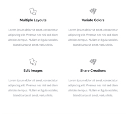
Feature Columns
Two rows with two columns each. Columns have a centered image at the top, followed by text. On mobile, the columns go full width and stack.
Content Left/Right
Two columns, one with a header, text and a link, the other with an image that sticks to the edge of the email container. They stack on mobile, and the one with the image on the right uses the awesome reverse stack techinque from our framework, for consistent hierarchy.

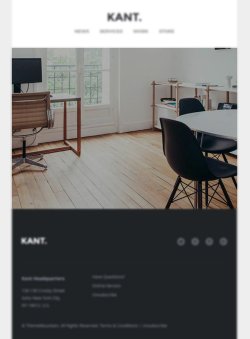
Full Width Image
A simple, full width image. This is an inline image, not a background image. So there's no need to worry for support, like is the case with Outlook.
Customisation
Buttons & Links
Links and buttons can be customised with inline CSS. Checkout the button component in our email framework.
Images
Simply change the src="" and width="". For retina images, you can keep the width="" defined by the template, and use an image that is double the width and height of the placeholder image, so that it looks sharp on mobile.
Top & Bottom Spacing
Change the height, font-size, and line-height: values on the <td class="spacer">:
<tr>
<td class="spacer" height="80" style="font-size: 80px; line-height: 80px; mso-line-height-rule: exactly;"> </td>
</tr>On mobile, these spacers are reset to be 30px high. You can change that in the embedded CSS: