
Because all good things must come to a great end
The template comes with several footers, designed for a wide varitey of use cases. They all include common things like a logo, address, social icons, and, of course, legal text/unsubscribe links.
Footers also use a Divider component from Pine, which you can customise just like a spacer.
Footer 1
Logo and social icons come first, separated with a divider from the legal text.

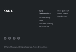
Footer 2
Logo and address or legal text come first, followed by the social icons and copyright text.
Footer 3
A balanced, centered mix of the first two footers.

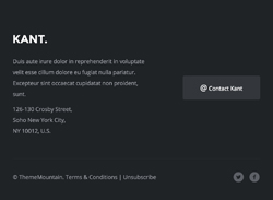
Footer 4
Add more text to your footer, and also provide a call to action button.
Customisation
Links & Text
Links and text styles can be changed via inline CSS.
Talking about links, Unsubscribe in the ESP-integrated versions uses the platform's special unsub link code, so you're covered out of the box. However, if you're using StampReady to build a layout for some other platform, remember to add your provider's code as the URL.
Logo & Images
Simply change the src="" and width="". For retina images, keep the width="" defined by the template, and use an image that is double the width and height of the placeholder image.
Background Colour
Change the HEX colour code inside bgcolor="" on the row table wrapper:
<table class="row" align="center" bgcolor="#1F2225" cellpadding="0" cellspacing="0">
    ...
</table>
Top & Bottom Spacing
Footers use both Universal and Row spacers from Pine, so you need to look for and adjust the values in both lines like this:
<div class="spacer" style="font-size: 80px; line-height: 80px; mso-line-height-rule: exactly;"> </div>... and like this:
<tr>
<td class="spacer" height="30" style="font-size: 30px; line-height: 30px; mso-line-height-rule: exactly;"> </td>
</tr>On mobile, these spacers are reset to be 30px high. You can change that in the embedded CSS:
.spacer {height: 30px; line-height: 100% !important; font-size: 100% !important;}Divider
The Divider component from Pine is used to separate content. To customise it, look for something like this:
<table class="row divider" cellpadding="0" cellspacing="0" width="100%">
<tr>
<th height="81">
<div style="border-top: 1px solid #2B2E32; font-size: 0; line-height: 0; mso-line-height-rule: exactly;"> </div>
</th>
</tr>
</table>